Top Access Tips to Pictures and Illustrations
Submitted by Gwyn McCormack on Jan 13, 2014

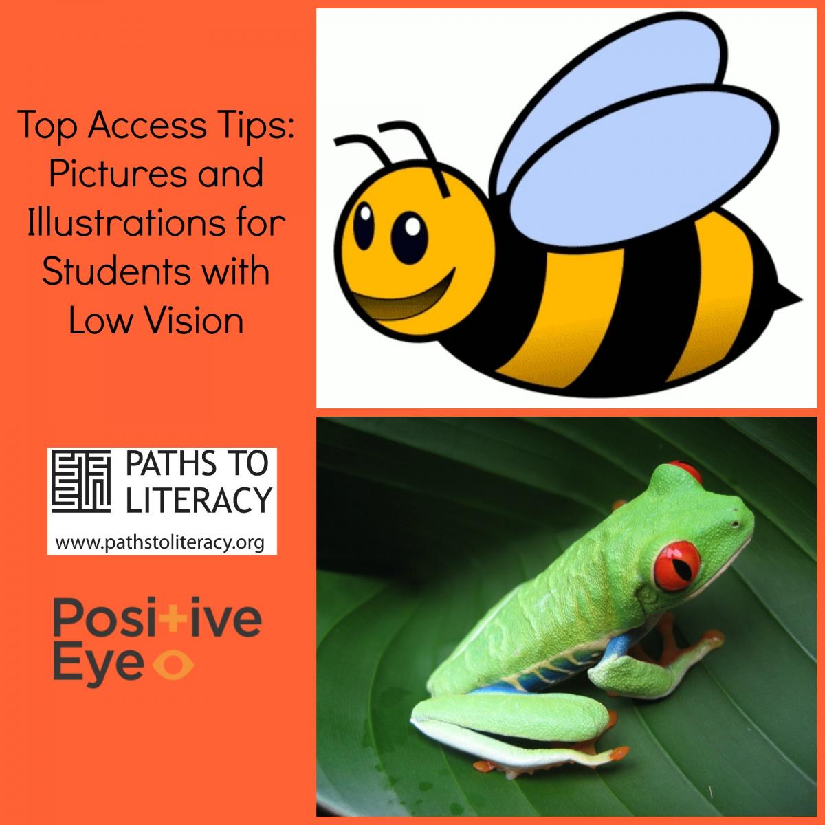
Pictures
1. Size of graphic
- Present clear, well contrasting, simple large graphics.
- Remove detail and visual clutter from graphic.
- Add black outlines to shapes and main key features.
- Remove complex colouring.
- Use colours which provide good contrast.
2. Captions
- Present captions for images in a consistent way throughout the document so that the child knows where to find them.
- Avoid overlaying text on a picture.
- Present text in child’s preferred print, typeface (font) and typestyle (bold, plain format).
Illustrations
- Present as line drawings, with thick black outlines.
- Remove unnecessary clutter.
- Make small details larger.
- Remove complex colouring.
- Use colours which provide good contrast.
Photographs

- Only use if simple and not too detailed.
- Make sure the important part of the image is displayed clearly
- Add black outlines to key features.
- Contrast of the photograph needs to be sharp and clear
- Provide written description of photograph to support understanding of key features.
Advice Point
- At Primary/Secondary level, consider the additional value the picture/photograph/image adds.
- Adapting pictures is time consuming and often used only briefly.
- Equally, accessing graphical information can further add to the child’s visual fatigue.
General guidance: Think about only adapting if the graphic adds or explains something over and above that which is contained in the text.
For further Top Access Tips Sheets visit https://www.positiveeye.co.uk/
Email: gwyn@positiveeye.co.uk