Effective Access to Communication and Literacy for Students with Visual and Multiple Disabilities

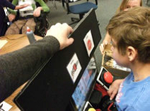
This webinar on communication and literacy for students with visual impairments and additional disabilities is presented by Faye Gonzalez, TVI and COMS from the Madison School District in Arizona. It covers strategies for using common assistive tools and devices more effectively with students who have visual and multiple disabilities, modifications to the environment and the materials to increase access, and key elements to consider when selecting and modifying an abstract symbol system for literacy and communication. The webinar and powerpoint explore some of the following points:
Using a Symbol System for Communication and Literacy
Many students with visual impairments and multiple disabilities struggle with symbol systems. Some of the problems include: 
-
Materials with symbols are visually complex.
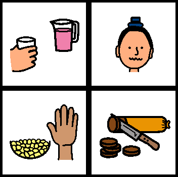
- Drawings can be very abstract (see example at right)
- Parts of symbol and the symbol itself are often very small
- Multiple colors can be visually cluttered and distracting
- Lighting and glare can be an issue
-
Learning medium often isn’t considered and an incorrect symbol type is chosen.
- Need to determine which sensory channel(s) are used by an individual student for learning.
- Learning Medium determines the type of symbols system that is most appropriate.
Communication and Literacy for Students with Multiple Disabilities and Visual Impairment (MD/VI)
- Communication & Literacy are intertwined
- Communication & Literacy are a way to share with others
- Incorrect use of symbols with MD/VI is a common barrier
Using a Symbol System for Communication & Literacy
- The ultimate goal is print/braille & spoken language
- A common alternative is a symbol or photograph-based system
- Many MD/VI students struggle with symbols
Common Problems Using Symbols
-
Materials with symbols are visually complex.
- The drawings can be very abstract.
- The parts necessary to determine exact meaning can be very small.
- 1 1/2” size typically used is usually too small.
- Multiple colors can be cluttered & distracting.
- Remember, students usually can’t read the text label...
- Learning medium often isn’t considered and an incorrect symbol type is chosen.
Specific suggestions and examples are included in the webinar and powerpoint.
