Five Tips for Better Digital Classroom Accessibility
- Tip 1: Provide actual text, not images of text
- Tip 2: Tip 2: The Four C’s
- Tip 3: Multimedia, Captioning, Interpreter, and Description
- Tip 4: Document and Slide Accessibility
- Tip 5: Advocate for Accessibility in Procurement, Installation, and Updates
Accessibility is a comprehensive topic; this provides a brief overview of selected strategies.
- Accessibility benefits countless students, parents, and teachers with and without disabilities
Disability and Accessibility
-
Students may or may not be identified with:
- Learning disabilities
- Dyslexia
- Print and reading disabilities
- Blindness and vision impairment
- Visual processing disorders
- Visual fatigue, changes to visual functioning
- Convergence insufficiency
- Visual motor skill and neurological processing considerations
- Variations in color vision/blindness
- Migraine and vestibular disorders
- Sensory integration
- Deaf and hard of hearing
- Motor and mobility impairment
- Health issues
- Many more
- Parents, colleagues, other stakeholders
Tip 1: Provide actual text, not images of text
Ensure text is presented as text and not as an image capture of the text
- Why: Text as images cannot be altered for font style, size, accessed by screen readers, braille displays, and other technologies
- Images of text are often blurry and do not allow for reasonable access with an OCR or language translator
- Requires significant accessibility “retrofitting”
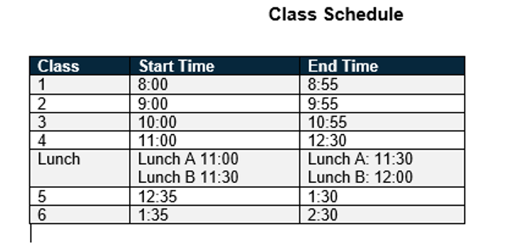
Example: Class Schedule (Actual Text)
Class |
Start Time |
End Time |
| 1 | 8:00 | 8:55 |
| 2 | 9:00 | 9:55 |
| 3 | 10:00 | 10:55 |
| 4 | 11:00 | 12:30 |
|
Lunch
|
Lunch A 11:00
Lunch B 11:30
|
Lunch A: 11:30
Lunch B: 12:00
|
| 5 | 12:35 | 1:30 |
| 6 | 1:35 | 2:30 |
Inaccessible Example

Tip 2: The Four C’s:
- Color
- Contrast
- Clutter and
- Crowding
Color Dependent Information
- Color vision
- Make sure that colors are not the only method of conveying important information.” (WebAIM)
- Example of color conveying information on next slide:
Example of Color Dependent Response (Inaccessible)
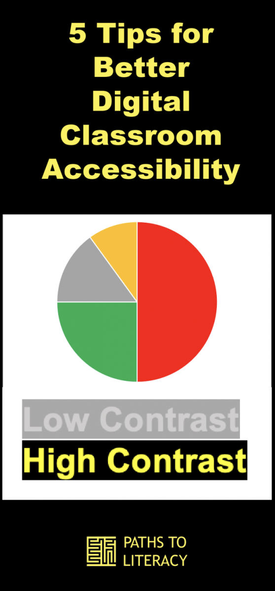
- Identify in the pie chart which color represents the greatest amount:

Colour Contrast Analyser (CCA) Paciello Group:
- Image Description: Screen Convert option in the Colour Contrast Analyser with the red, green, yellow, and gray in simulated Deuteranopia colors
- Accessible Option
- Provide text for each color, numeric value, or other detailed, non-color dependent information
Inaccessible Example Color Dependent Response Example
- Group assignments: please move to the breakout room for your assigned team color:
(Description: the names Amy, Aveen, Ahmed, and Alex are in green; Chris, Natalie, Jose, and Viviaan are in red)
Accessible Option Suggestions
- Label each group, red and green, with student names under each group title
- Use an * or underline or another discernable feature for each group identifier
- You Try:
Inaccessible Example:
Identify Accessibility Issues and Alternative Options
Parent Information Sheet: Red indicates a required field; green is optional:
- Parent/guardian name:
- Student (child) name:
- List any volunteer services you are willing to provide in our class this year:
- Preferred phone number:
- Preferred email address:
- List days and times you are available to volunteer:
- List items (cleaning supplies) you are willing to provide to our class:
- Please let us know about your child and anything we can do to provide support this year:
----------------------------------------------------------------
(Description: Prompts 1, 2, 4, 5 and 8 are in red; 3, 6, and 7 are in green)
Contrast
-
Test for color contrast:
- Colour Contrast Analyser (CCA) Paciello Group
- WebAIM Contrast Checker
- The next slide contains examples of low and high contrast
Low contrast is represented with a light gray background and gray text
High contrast is represented with a black background and yellow text

Impact of Contrast Affects individuals with:
- Visual fatigue
- Some refractive vision conditions
- A common change noted in some age-related vision conditions
- Certain processing and neurological conditions
- Many Others
Options:
- Preferences for contrast varies significantly for contrasting colors
- Inverted contrast v. non-inverted colors (inverted may be black background with white text)
Impact of Glare and Brightness
- Highly individualized
- Brightness: Preference varies significantly
Low v. high
- Impact of glare
- Importance of assessment and evaluation for customized settings (monitor, computer, devices)
- Teachers: provide materials that allow for customized changes
Clutter and Crowding
- Many students with various known and undiagnosed disabilities benefit from less visual clutter and font/writing that has adequate, non-crowded spacing
- Provide ample space between items, separate complex information, or allow for customized alteration of documents and materials
- Tight lines, patterns, abundant visual clutter can present a challenge for individuals with vestibular disorders
Tip 3: Multimedia, Captioning, Interpreter, and Description
- Captioning and Interpretation
- Captioned media and live captioning
Deaf/Hard of hearing, students with auditory processing disorders, those new to learning English, and many more people benefit from captioning
- Sign language services: consult with your school system on procedures
Description: Video and Instruction
- Video description: provides audio narration of visual information
- Direct instruction: give descriptive information: Instead of “the formula is there”, read the formula and note its location
- Provide descriptions of complex tables, charts, visuals
Multimedia: Seizure and Vestibular Considerations
- Vestibular disorders are diagnosed more frequently among students and adults Challenges: Static text on top of a moving background, animations
- Seizures: Challenges: Flashing, flickering, strobing, optical illusions, continuous motion, various movement
Migraines: some are triggered by visual elements, auditory noises/feedback
- WebAIM Seizure Disorders
Tip 4: Document and Slide Accessibility
Document Accessibility: This is an abbreviated list:
- Use headings in your documents and webpages
- Use high contrasting colors
- Provide alt-text
- Specify link in context
- Repeat row as header on tables
- Learn How: Microsoft: Training Teachers to Author Accessible Content
- Google Documents and Slide Accessibility
- Alt Text in Google Docs: Demonstration
- Headings in Google Docs: Demonstration
Tip 5: Advocate for Accessibility in Procurement, Installation, and Updates
- Procurement: programs, multimedia, electronic textbooks, applications, software, and hardware purchased must be accessible
- Accessibility must be embedded
- VPAT: are they reliable?
- Adoption: adopting applications and other programs, check for accessibility
- Updates: new program, device, and software updates sometimes “break” accessibility features
- Administrators: consult with accessibility specialists for this involved topic
Accessibility
- Accessible materials, devices, and media make all the difference for students, but requires a team and proactive approach
- Retrofitting accessibility is an intensive and costly process
Bonus Quick Tips: In-person and Hybrid Learning During COVID 19
- Please consider placing contrasting tape/markings around the perimeter of plexiglass
- Use high contrasting physical distance markers
- Contrasting color choice will depend on the surface color on which they are affixed
- Provide clear information for non-drivers to access curbside and parking lot waiting room services
Please Take Care of Yourself!
- The 20/20/20 rule
- Ergonomic monitor and positioning
- Customized settings
Resources
- Assistive Technology Initiative (Mason): Document Accessibility
- Google Documents and Slide Accessibility
- Learn How: Microsoft: Training Teachers to Author Accessible Content
- Virginia Department of Education Accessibility Resources
- W3C Web Accessibility Initiative
- WebAIM: Web Accessibility in Mind
Watch the Webinar of this Presentation!

